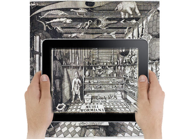
How can we induce positive, inquisitive experiences for visitors to our online collections? Can we evoke a natural, unguided sense of curiousity? Do online collections feel liberating and free or are their objects seemingly compartmentalised and isolated? Exploration involves seamless transitions from place to place, yet the online world is blockaded by arbitrary walls : the boxes, borders, categories, page refreshes and transitions that characterise the current nature of interaction on the Web.
Borrowing from concepts presented by new media theorist Janet Murray, I will articulate the Web as a medium of human and cultural expression, and hint at the opportunity to think beyond the current conventions on how we represent our collections online.
For years, lists, tables and categories have been a staple convention for information organization and are reminiscent in the dominant ‘database model’ and its associated fetish for compartmentalization : objects in online collections are often grouped by department, exhibition, medium category and class. In many cases, these (arbitrary??) groupings are the sole basis of their contextualisation. Aside from the infamous “stingy” search box, they are often used as a way of providing an entry point into the collection. Does this characterise the mindset of someone who would want visit our online collections? Are they the destined compartmentaliser who is enticed by a series of doors? Or perhaps they are more like Alice, who would rather tumble down the rabbit hole and experience the wonders within?
While the established convention of containment is immensely useful for storage and retrieval (which follows from decades of established conventions within the library and information sciences, and from current affordances that originate from the historical task-based nature of our interactions with computers in general), should we question its effectiveness as a means for giving us experiential browsing experiences within our online collections? Can current conventions recognise the nuanced and multiple relationships that objects have with one another, or do they provide nothing more than a series of filing cabinets with pretty pictures?
We’ve already seen a shift in representation that emphasizes generosity and showing everything. This gives us a top-down and liberating view of collections that are made possible only within the digital medium. As we know from Lev Manovich’s captivating example of his aggregation of TIME magazine covers and more recent works by Mitchell Whitelaw, giving an expansive, immense and generous view of collections allows visitors to gain insights in new and unprecedented ways. Showing everything emphasises the homogeneity and heterogeneity of our collections, yet perhaps we can establish a new conventions that establishes boundaries between unexpected collations and the surprising (and multiple) relations that objects have with one another? Should we conceptualise our online experience of in terms of landscapes rather than containment? Should we frame our design decisions, or daresay, establish new design conventions that exploit the incredibly expressive power of the digital medium to provide a sense of space, immersion, curiousity and wonder?
I propose that we move beyond the idea of menus, categories, classes and containers, and open our mind to much more expansive means of expression of our collections within our digital medium. In this workshop, I will introduce Murray’s concept of the landscape as a metaphor for expression within the digital medium, and provide examples on how this way of thinking could support new interfaces that realize the multiplicity of relationships and aggregrated suprises that are present within our collections.
Let’s have a real think about the qualities within our collections and how we could better express them online outside the confines of containers, and for how we can seed new ideas and conventions that support the natural desires of wonder, engagement and curiosity.


Pingback: THATCamp Wellington (22 November 2012) » clerestories
Pingback: » ndf2012 : intersections and emotive interfaces